Redesign: Version 6.0
Once again, I've redesigned my website. Every now and then I get bored of the way it looks, or I notice a lot of people cloning it and feel like I have to make something more unique again. The last time I changed it was September of last year, so I almost made it a full year without a complete redesign. Of course, if you look at the version I blogged about in the last redesign post vs. the one I had right before updating, you'll see it changed a lot. I tend to never be completely satisfied and tweak it a lot. It's always my hope that I can tweak less and write more! But this is my procrastination hobby, I guess.
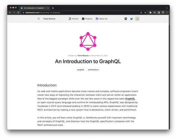
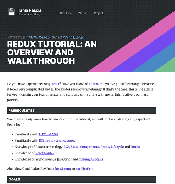
Here are the last few redesigns:
New Layout
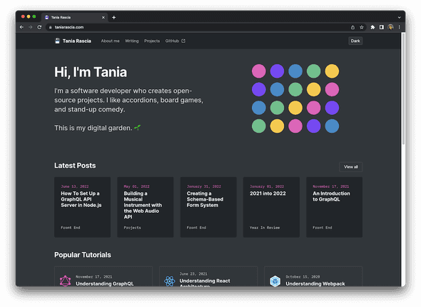
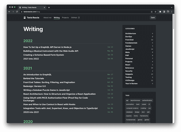
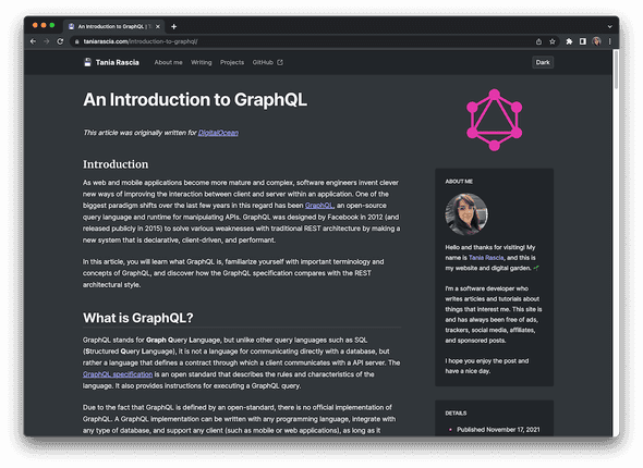
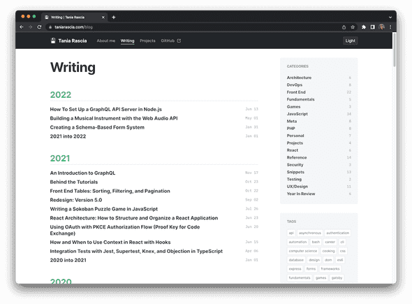
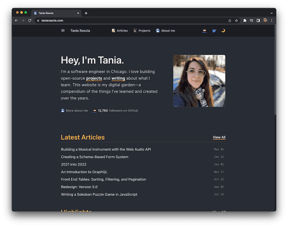
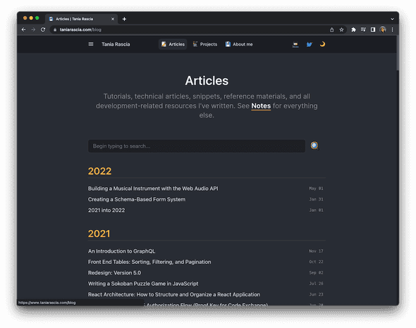
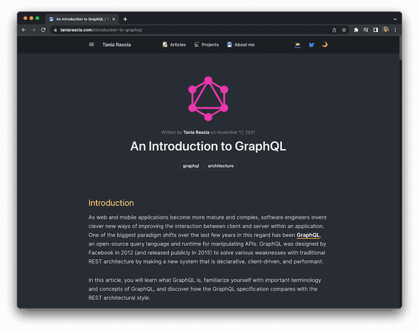
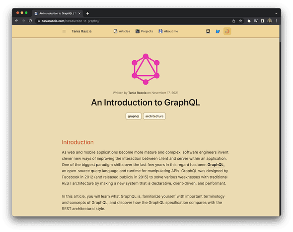
Here's how the new layout looks:
Front page:
Blog page:
Post page:
Light theme:
Old Layout
Here's how the latest (let's call it version 5.1) looked before I updated it.
Front page:
Blog page:
Post page:
Sepia theme:
Light theme:
My original plan was to make the site have a bunch of 80s themes. I wanted it to look like an old VHS, which is a design I really love. I couldn't quite get it right then just decided to stick some of the colors in, but here's an idea of what that was starting to look like.
Notably, I added category and tags lists, and I added a sidebar to the posts page. I think the fonts and sizes and colors are cleaner now, even though it was already pretty good. I feel like this design opens it up for me to add more stuff to the about page, like links to personal posts that I might like to highlight. A sidebar is missing from that page, but I haven't decided what to put there yet.
Do you like it? Hate it? I had it sitting there, half way done, for quite a while, and felt like I couldn't make any posts while it was pending, so I finished it up while I was just laying here at home sick with Covid. Now I have some ideas for posts to write and I can do that without being distracted.
Comments