Redesign: Version 5.0
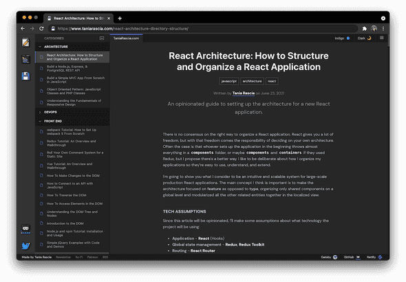
Over the last week or two I've had a lot of fun building out a new site from scratch. I thought it would be fun to make my site look like a VS Code application. I didn't want to go full gimmick with it, but it's highly inspired by spending all day working in an IDE.
I've always tried to keep my site very clean and minimal and distraction free, but this means that the average person who lands on my site most likely does not explore any further because it doesn't seem like there's anything else to see. So I've decided to change it up this time around and categorize all my posts and make a category sidebar.
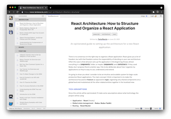
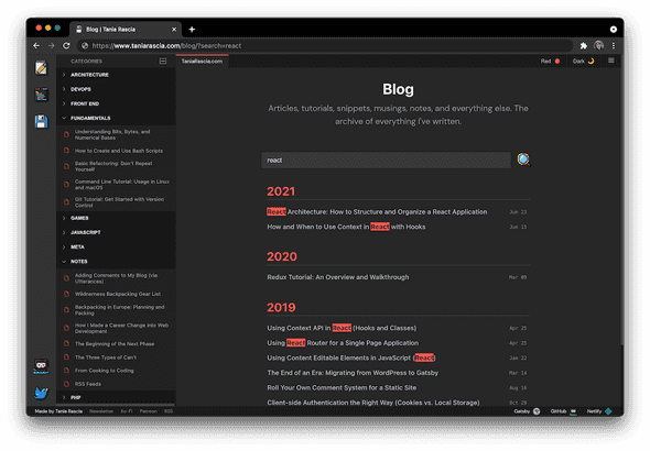
What do you think? I had fun making little pixel icons, of a floppy disk and a Twitter bird and GitHub OctoCat and so on. I wanted to add a little 8-bit retro vibe to the site and make it more unique than just using emojis or icons. I also implemented a little theme switcher at the top, where not only can you switch between light and dark, but also choose the primary color of the site.
For example, here it is in red:
I wrote the CSS from scratch in a single file, because I always find that the easiest and fastest. I've tried the whole CSS-in-JS thing multiple times with multiple libraries, and I still see way more pros to just using plain CSS or SCSS. I did my best to make sure all the focus states look good, and the whole site is tabbable by keyboard.
Implementing the light theme was simply a matter of overwriting some variables in a light theme class.
:root {
  --font-color: white;
}

.light.theme {
  --font-color: black;
}
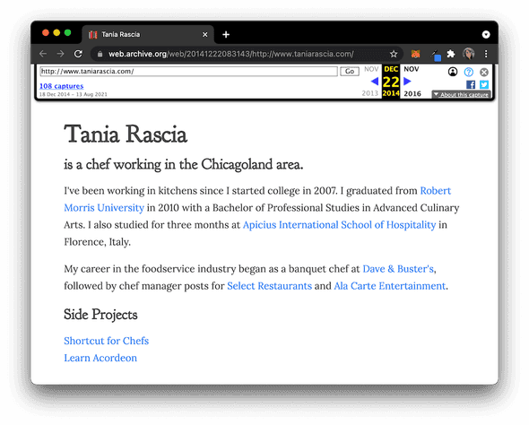
This website has gone through a lot of iterations. I mean, a lot. Take a look at the very first iteration of the site, from way back in 2014. (Yes, that's an accordion favicon.)
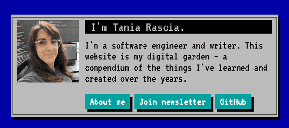
The blog has come a long way since then! I wrote about Version 2, which was really semantically somewhere around version 1.863.0, and then I wrote about Version 4, because apparently version 3 didn't happen. Really, I haven't really cared about versioning this site, I just get excited about some change and perpetually tweak it. Which includes making my site look like an MS-DOS prompt as some point.
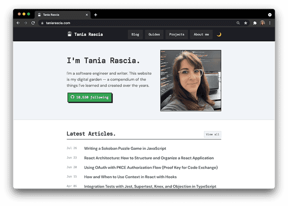
Here's what the site looked like until this release:
I'm excited about this design, because the site is more interactive, more personalized, and yet familiar. And I just had fun doing it. Hopefully you like it, too!
Comments