Making the Internet a Better Place
At the age of 9, when I was too shy, young, inexperienced, and insecure to know how to make friends in the real world, I discovered the internet - and it was awesome.
Maybe I'm looking back at it all through the rose-tinted glasses of nostalgia - conveniently forgetting pop-under ads, horrible dial-up speeds, falling snowflake gifs, and the infinitely nested BBS.
But I think anyone who was there remembers it as a truly special time. I feel immensely lucky that I grew up right in that transitionary era, a sliver of time between two completely different universes. I experienced a childhood in which my choices were limited, I went to the library to learn new things, and I discovered music on analog cassettes and LPs. Then I spent the most formidable years of my adolescence discovering the world and myself through the internet when it was the wild west.
To be honest, I don't really like the internet anymore. Of course, it's still an incredibly useful tool and there are still pockets of what made it amazing to begin with, but it's getting harder and harder to find amidst all the noise.
When I use the internet now, I feel like I'm just a piece of data to be exploited. Some data to be analyzed and marketed to. You can't look up a recipe without being prompted with desperate attempts to influence your behavior, a video pop up, a cookie consent notice, dozens of ads, and clickbait littered throughout the page. Try looking up just about anything without getting "7 ways to..." and "12 surprising examples of..." type of shit headlines meant to drive traffic to their useless website.
In the beginning, social media was a place to be creative and make your little corner of the web even if you didn't know any HTML. It became a place to connect with your friends, share a bit of your life, and do stupid little quizzes and games. Now, all social media is useless. Just another medium through which ads and far too many opinions can be injected into your brain.
Although the tide is against me, I want to make the internet a better place. Even if it's just right here. I hope I will inspire others to make their own creative corner of the web.
The Things We Don't Need
I decided to redesign my website and start from scratch and make sure it was a clean, easy-to-navigate site that didn't have a single thing it didn't need. I tagged this latest version 3.0 (previously I wrote about version 2.0 and version 4.0, and version 1 was actually like 200 versions, so I'm not very good at versioning this site). In my sidebar, I list a lot of the things this site doesn't have, and I'll reiterate them a bit here.
Before anyone freaks out at me, I'm not judging anyone who has one or more of these things on their site. I just don't want them. And I do wish less websites had them, but if you're actually making a living from ads that's none of my business.
No ads
One of my favorite websites is Hyperbole and a Half. And I remember reading her thoughts about having ads on the FAQ a long time ago:
"I feel that having advertisements on my page creates a sort of weirdness about my motivation for writing. I think some people feel used when a site they enjoy is plastered with ads, and I don't want to make you guys feel like that. I'm more comfortable having just the one little button for my store. It feels less intrusive and it lets people choose whether they want to support me or not." — Allie Brosh
I distinctly remember reading that and thinking...you have such a successful blog, why wouldn't you want ads? It's free money. The fact that someone with one of the most visited blogs on the internet wouldn't want ads really stuck with me.
From the first day this site was published in September 2015, there has never been an ad on it. I have, over the years, made a few thousand dollars in donations and support. For the first few years, I didn't have any donate button at all because I thought it seemed weird, spammy, and needy to have one, but I realized when you do something cool, people want to show their appreciation.
I'm obviously not trying to (and would be unable to) make a living from this site, but the readers and I have a symbiotic relationship where they get quality content, I have fun making the content I want, and if anyone would like to support it they can. I don't care about spamming my website out, because I don't get money from visits.
I have always thought to myself (and I discussed this on with Joel Hooks on the egghead.io podcast) that if I resorted to ads, I would be giving up. I still believe eventually I can write a book, course, or some other content that people will voluntarily pay for (some day!).
No social media
This site doesn't need a link to Twitter, or LinkedIn, or Facebook, or anything else. Nobody needs to know how many followers I do or don't have. Of course, I think this extends beyond just the website - I deleted Facebook years ago among other social media platforms and I would highly recommend it to everyone. I stopped going on Twitter (and reddit) except for the occasional poll to the community and to share new posts, but even that limited exposure is starting to feel like too much. No matter how hard I try to curate my feed, it's impossible not to see angry mobs and brigades. I have made some good friends and discovered some opportunities through Twitter as well, so it's difficult.
I can anticipate at this point that some people will see me as pretentious and stuck-up, thinking I'm so superior because I don't do social media. Honestly, if a real platform existed where I could just communicate with my friends, make new friends, and read blogs by real people with no corporations or ads, I would love to be a part of that. I just don't even know if it's possible anymore. I don't know if any centralized platform can do that in 2020. Fortunately, we have our decentralized websites, and we can connect with each other this way.
No tracking or analytics
I removed Google Analytics from the site. I had it on there for years, and I know somewhere between 200,000 and 300,000 people visit the site per month, and 80% or so is organic search. I glanced at it maybe twice a year, and I never made any decisions based on the data on there. Since I'm not trying to drive any traffic to my site for ad clicks, it doesn't really matter how many hits to the site I get. So from this point forth, I'm removing it. And on that note...
No third party scripts
Aside from Google Analytics, I think I only had one third party script, which was a little script to pull the follower count from GitHub for a site badge. It was cute, but unnecessary. I thought that having the follower count added a little bit of credibility to my name at first glance for anyone who doesn't know me, but ultimately I don't want to be motivated by numbers.
Update: I'm testing out Utterances, which is a really cool open-source project that uses the GitHub issue API for comments, so I can't strictly say I have no third party scripts at all anymore, though I think this one is very clean and useful.
No sponsored posts
Not a day goes by that I don't get an email from someone asking to put a sponsored post on my website. I'm not sure where anyone ever got the idea that I would put a sponsored or guest post on the site. First of all, it's taniarascia.com. It would be pretty weird if every other post was written by someone else.
No affiliate links
My first ever paid webhost was NearlyFreeSpeech.net, and somewhere on their FAQ they posted "Affiliate programs make it difficult for a web designer to make objective recommendations about what's good for your business. So good web designers generally don't participate in affiliate programs, and you can rely on their advice. We don't have an affiliate program, so when someone recommends us, you can be comfortable that it's because they like us and think we're a good fit for you." I thought that was pretty cool. I'm not selling anything, but I wouldn't feel comfortable doing any sort of affiliate program.
No paywall
All the content on this site is free and freely accessible. It's incredibly annoying to be looking something up and find a post that matches what you're looking for, only to discover it was posted on Medium, so you have to go through a bunch of hoops to view it without making an account. Also, Medium doesn't have syntax highlighting for code blocks, so I wish people would use a different publishing platform for dev content in general.
Comments?
This site originally had comments, and there were some pros to this. Comments gave a lot of proof to the website. For example, one of my first popular posts was the WordPress theme development guide - that post alone had over a thousand comments, two or three years ago. It was easy for someone to quickly scan the comments, see that there were so many and that they were all positive, and know that the article would probably be helpful. I don't have anything like that anymore, only the reputation that I hope I've built over the last 5 years. Comments also made the site interactive, and potentially gave people a reason to come back.
Update: I'm testing out comments now, so it remains to be seen whether or not they stay.
So What's Left?
I thought the old design was pretty good, but it was a little too simple.
Organization
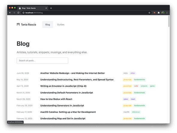
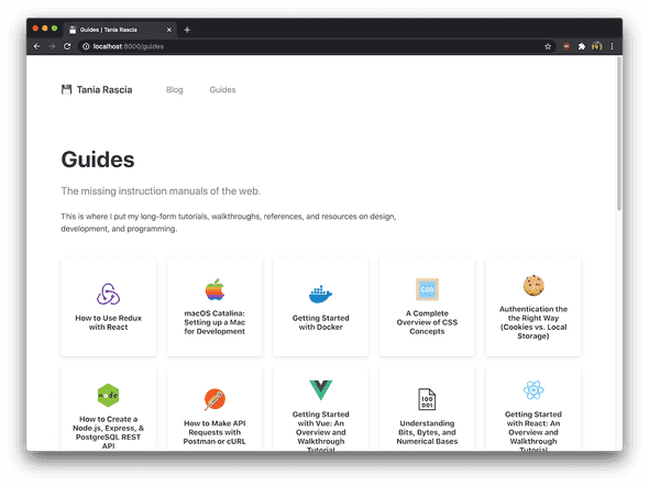
I haven't written much lately. I haven't had time to write the long form articles that I would like to, and I keep feeling like small snippets, notes, opinions, musings, and so on didn't have a place in the old blog. So now, I've divided the site into two sections - the blog, which contains everything, and guides, which contain my complete tutorials, walkthroughs, and reference guides. I also tagged everything nicely. This was my biggest reason for redesigning the blog, and I think I'll feel more comfortable to make posts about anything I want now.
I want the site to be less of a blog and more of a digital garden, which I read about through Joel's site. I want to have more fun and whimsy with it. It's not completely there yet, but I feel more free to add whatever I want, wherever I want.
Search
The search was extremely lame - I quickly hacked it together and all it did was search the titles in the DOM. The biggest new thing I've added to the site is flexsearch, so the search bar actually looks through the whole post body as well as tags, metadata, etc.
Originality
My site is open source, and the old design was up for a few years. As such, many people cloned the site, so it didn't feel very unique to me anymore. The design of this one isn't much different, because I love that simple minimalist look, but the structure is a bit different.
Simplicity
I wanted to be absolutely certain that no dependencies or code existed in my codebase that weren't necessary. I also wanted to use the latest version of Node (14.4, as of this writing), so I redid everything from scratch. I also wrote all the CSS in one style.css file, without any Sass or libraries or anything else.
Speed
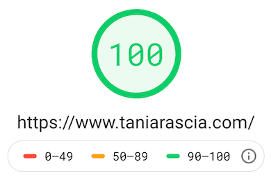
Just having the essentials has kept the site extremely fast.
A fast site is extremely important to me. I highly recommend Gatsby and Netlify.
Here are two pictures of what it looks like, as I'm sure in a year I'll have a new layout once again.
Final Thought
I hope you like my site. Having a place to call my own on the internet has always been important to me. When I created this blog, I finally found something that I love doing that helps others as much as it helps me. And it has created so much opportunity in my life. If you're thinking of making a website, I hope you do it. If you're thinking of deleting social media, I hope you do it.
Here are a few sources of inspiration that I used for the site.


Comments